Brand Identity
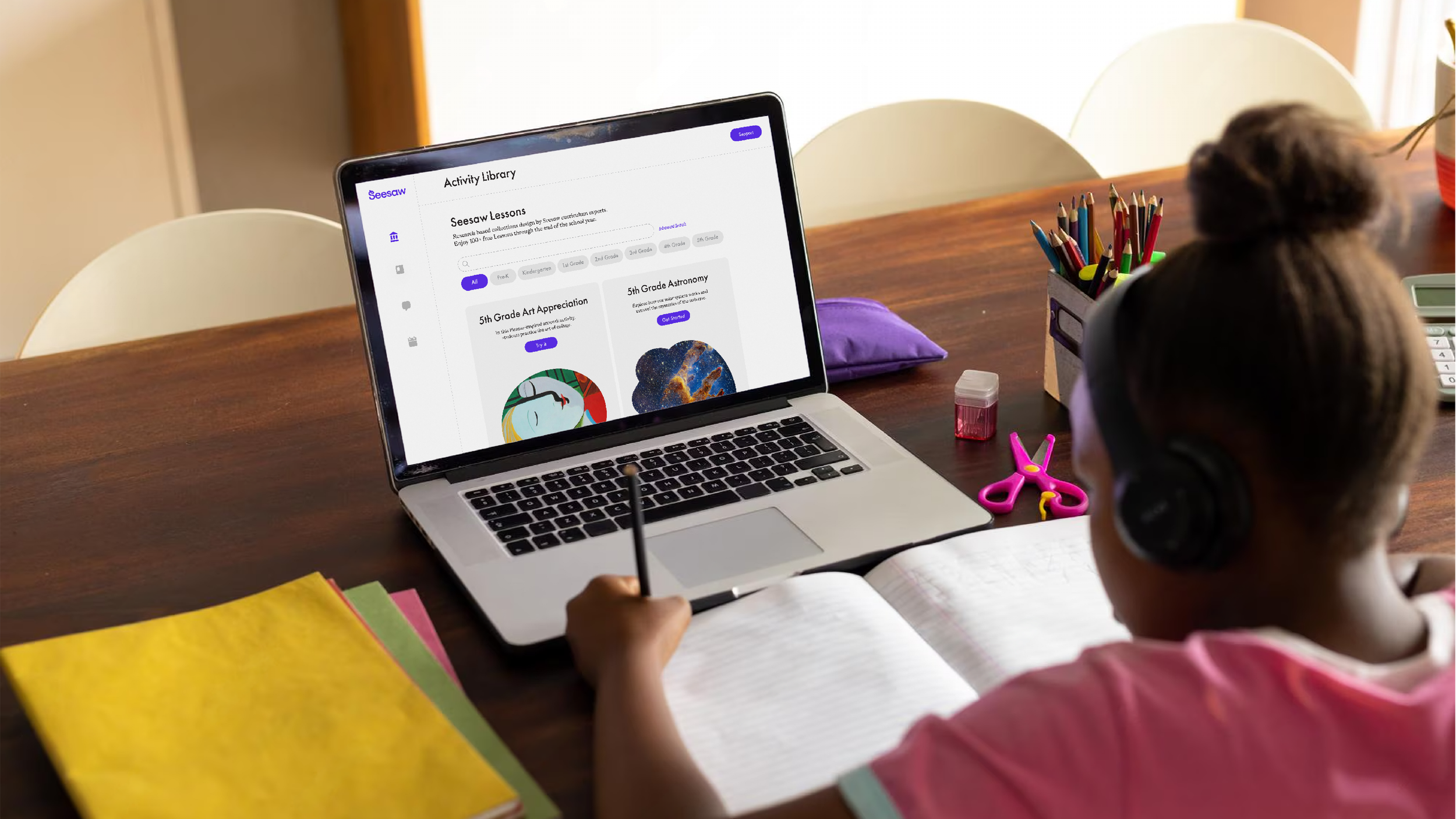
Seesaw is a digital learning platform built for PreK–6 classrooms that connects teachers, students, administrators, and families in a shared learning environment. With more than 25 million users worldwide, the platform helps schools strengthen communication, document student growth through digital portfolios, and create more engaging classroom experiences.
Seesaw

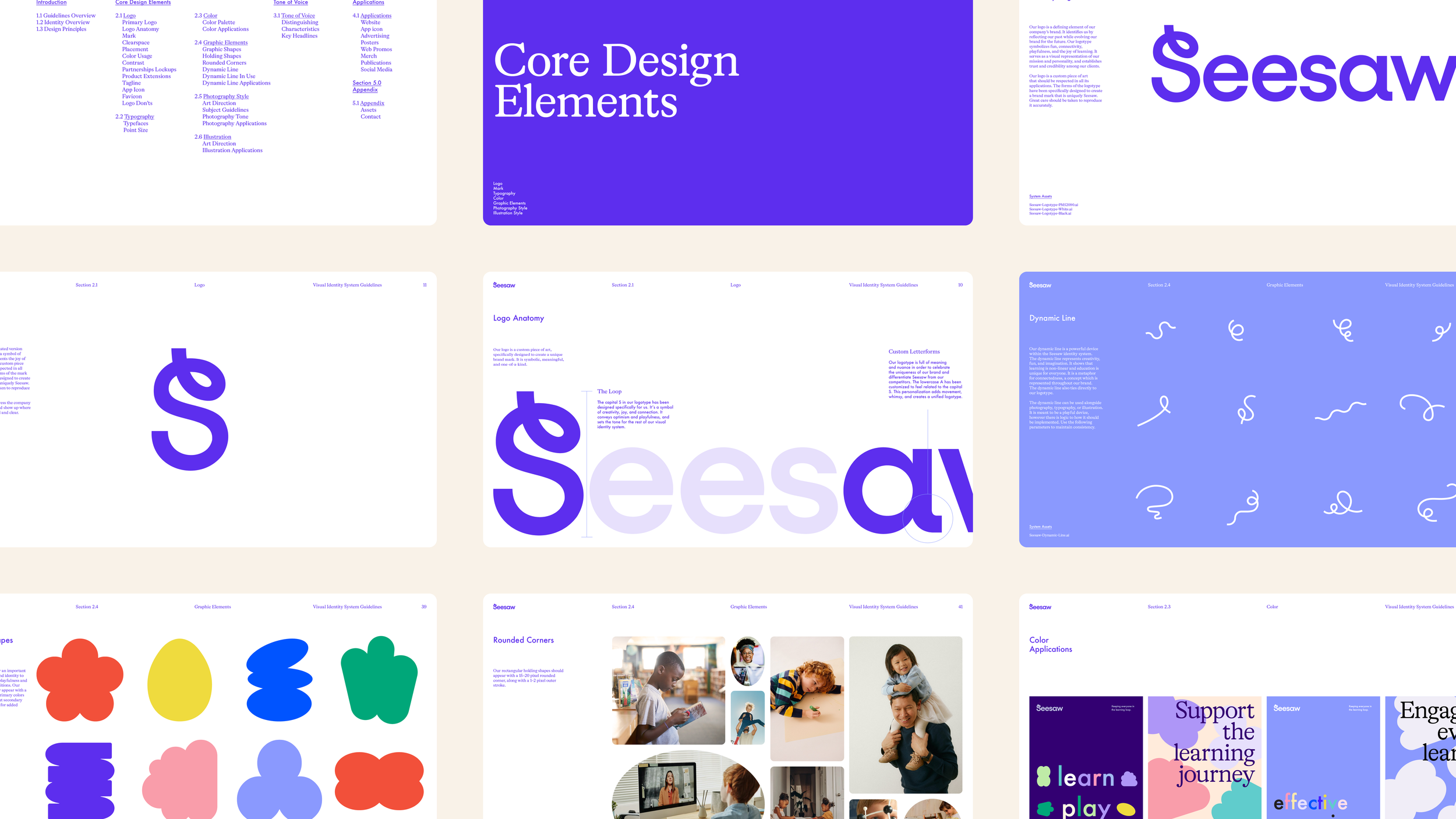
Our work focused on evolving Seesaw’s visual identity to better reflect the energy and creativity of early learning while establishing a cohesive system that could scale across product, marketing, and communications. We refined the Seesaw logo, developed an expressive visual language, and created a library of design assets and templates that allow internal teams to consistently bring the brand to life.
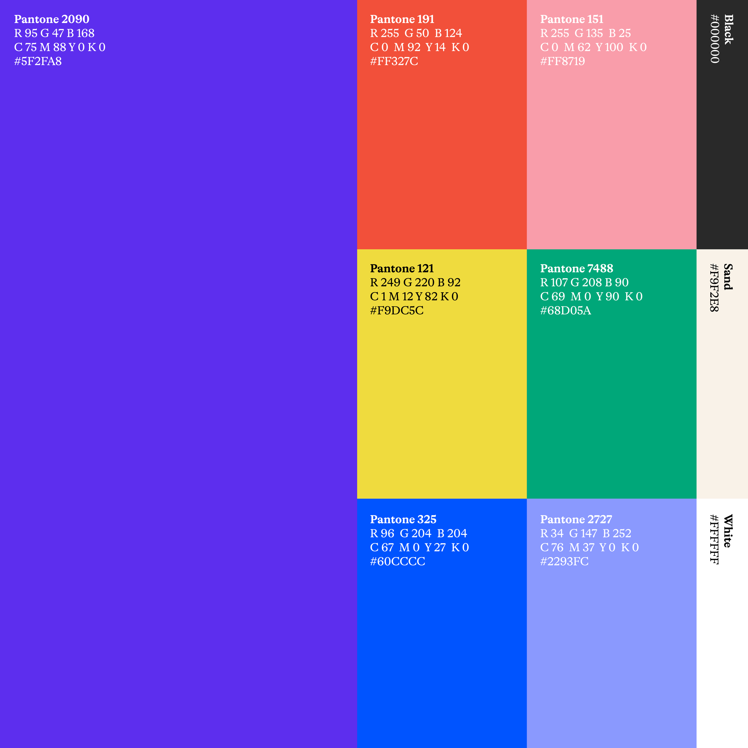
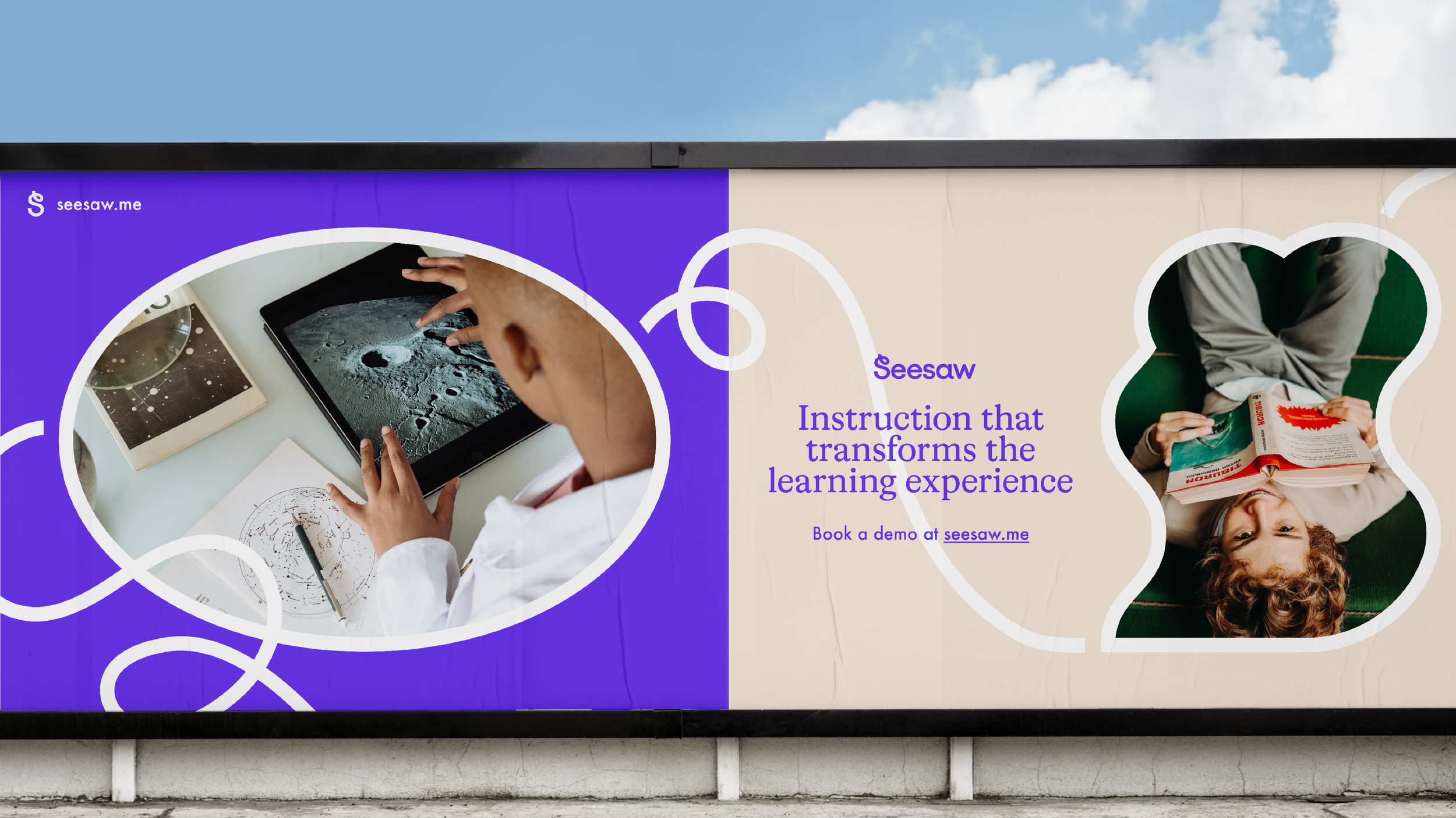
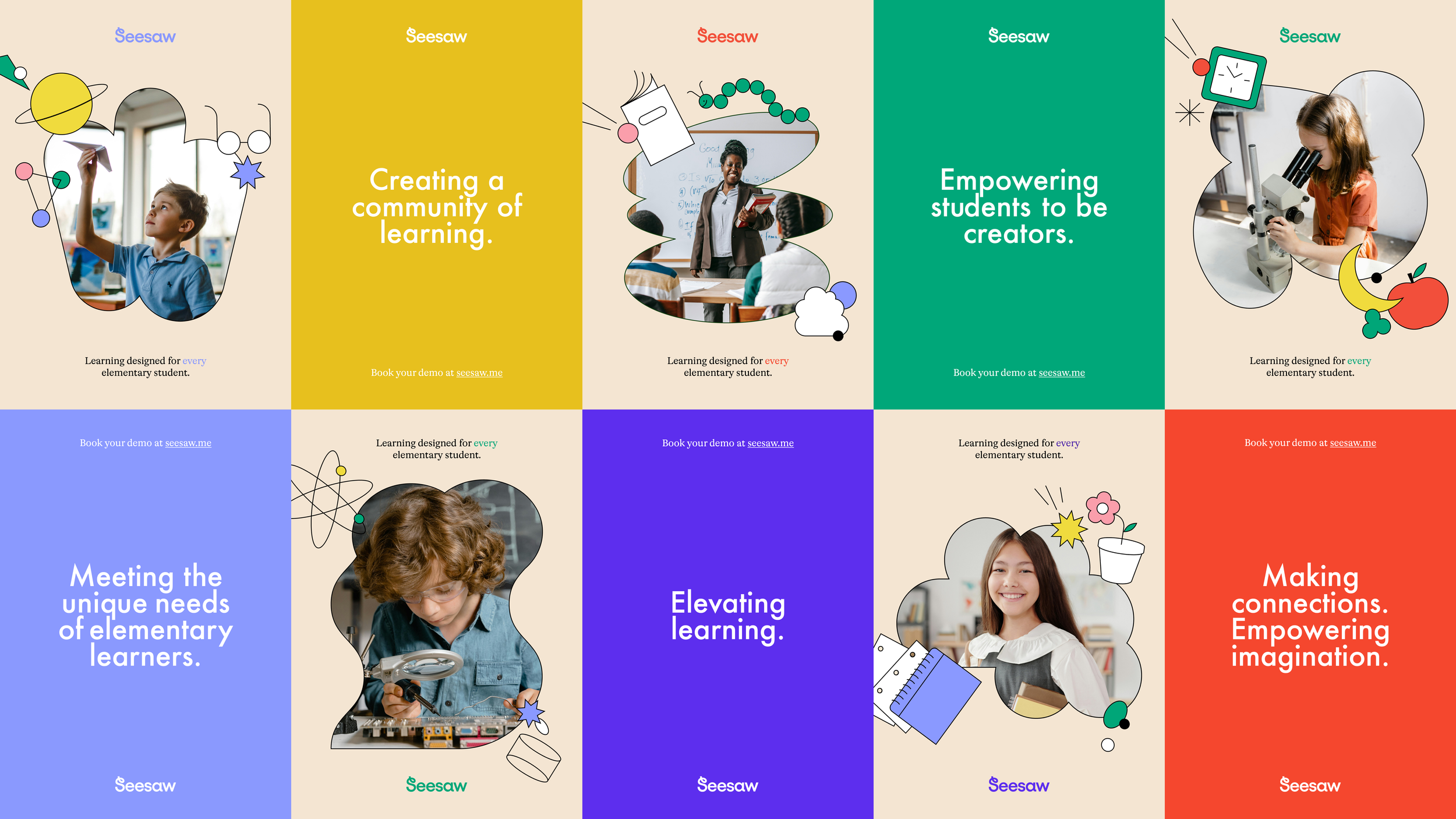
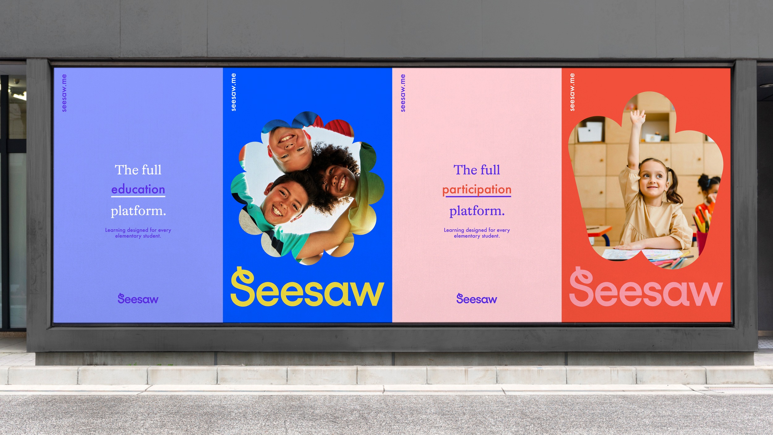
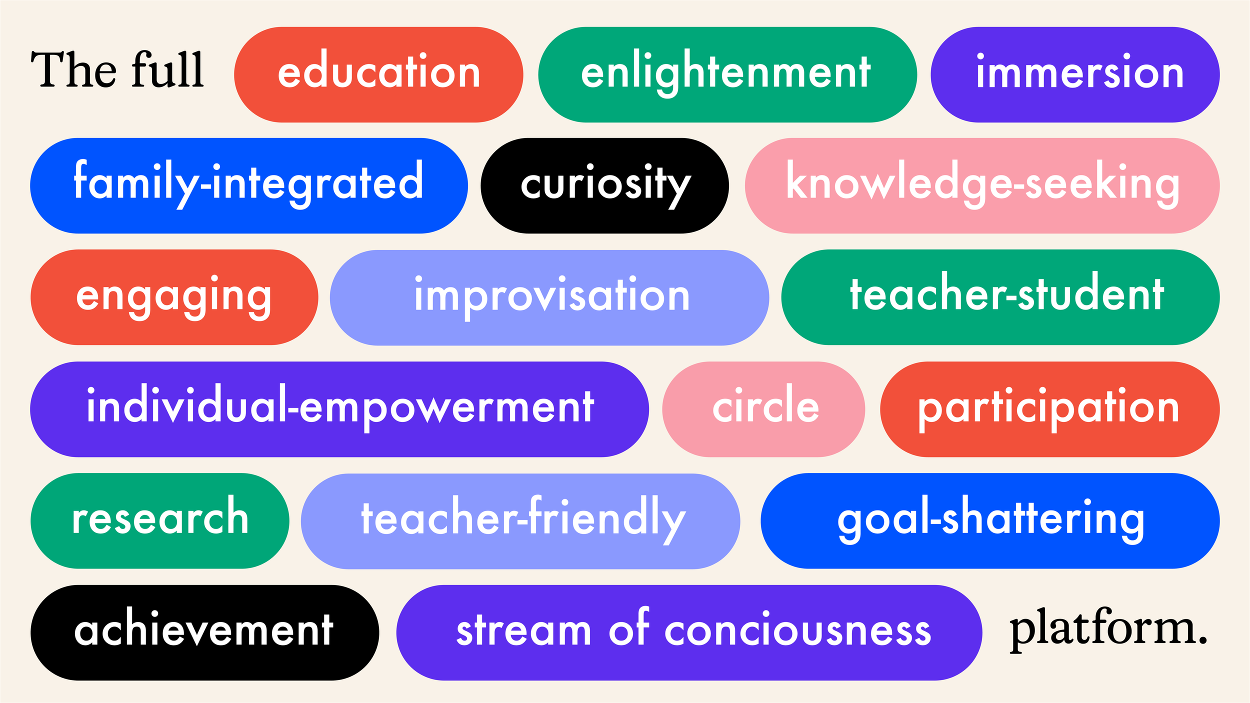
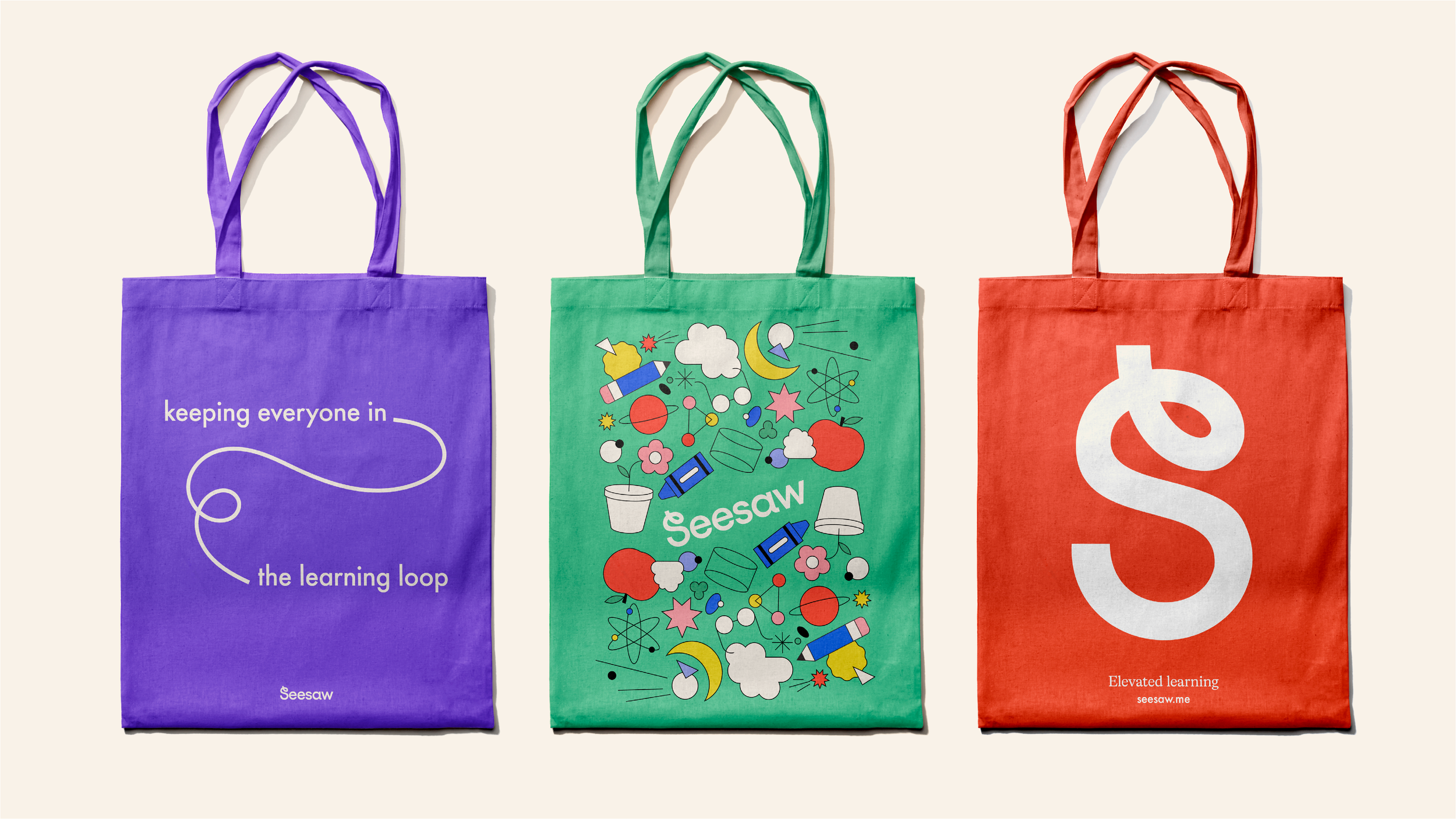
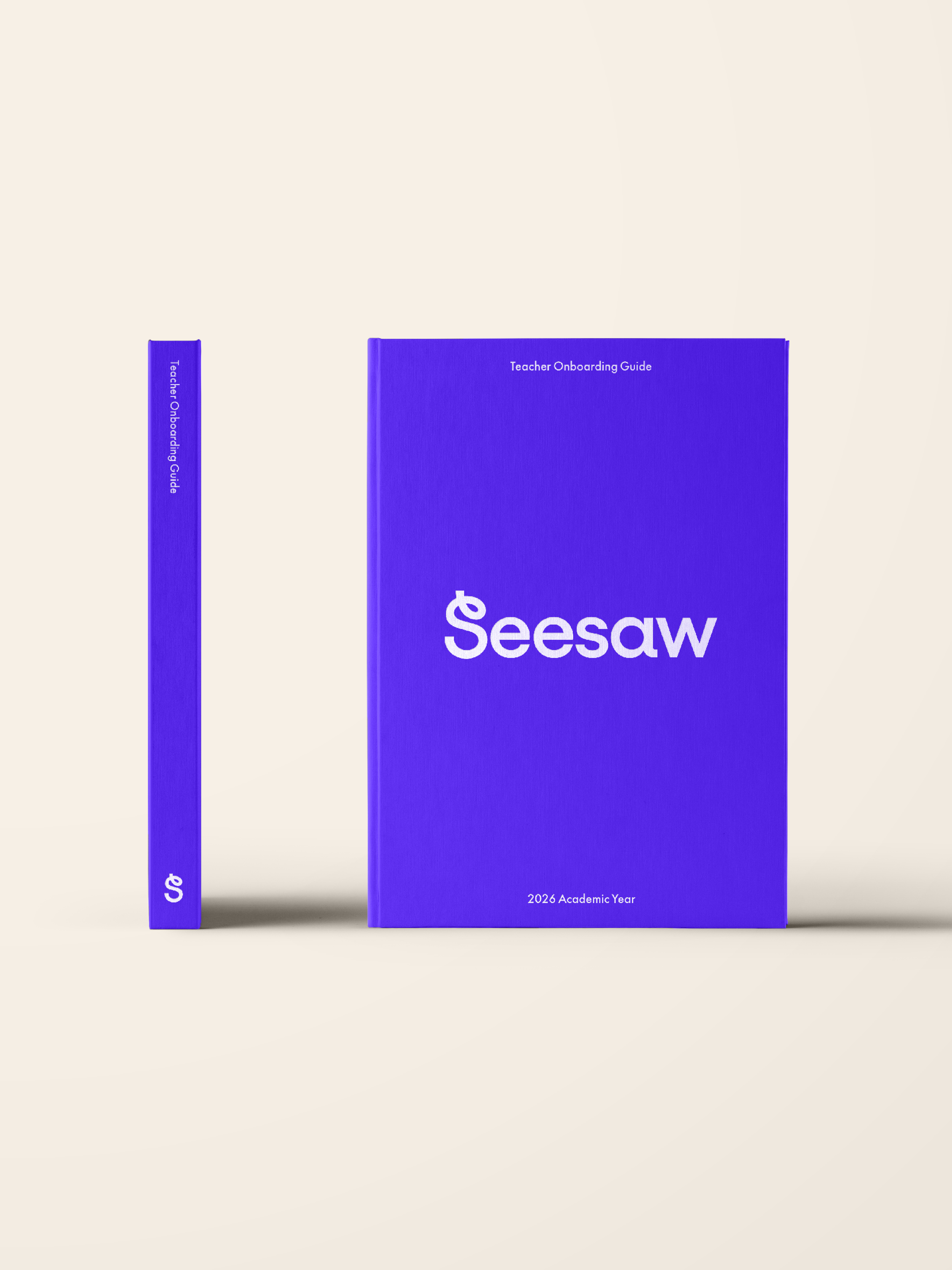
The identity system begins with the evolution of the logo and its core components—introducing a flexible symbol, a vibrant color palette, and a typographic foundation designed for clarity and warmth. From there, the visual language expands through playful shapes, illustrations, and graphic patterns that echo the creativity of student expression.
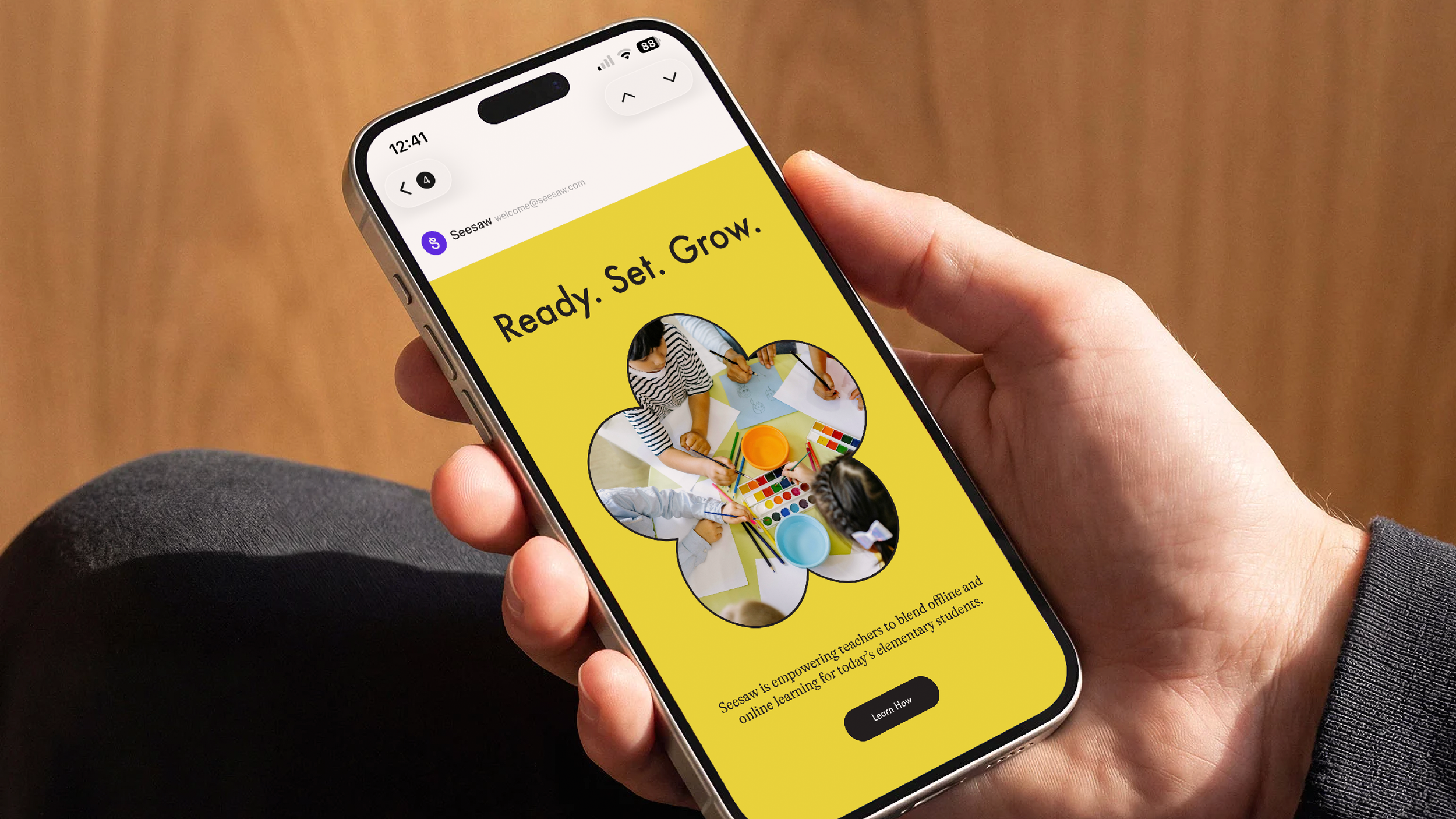
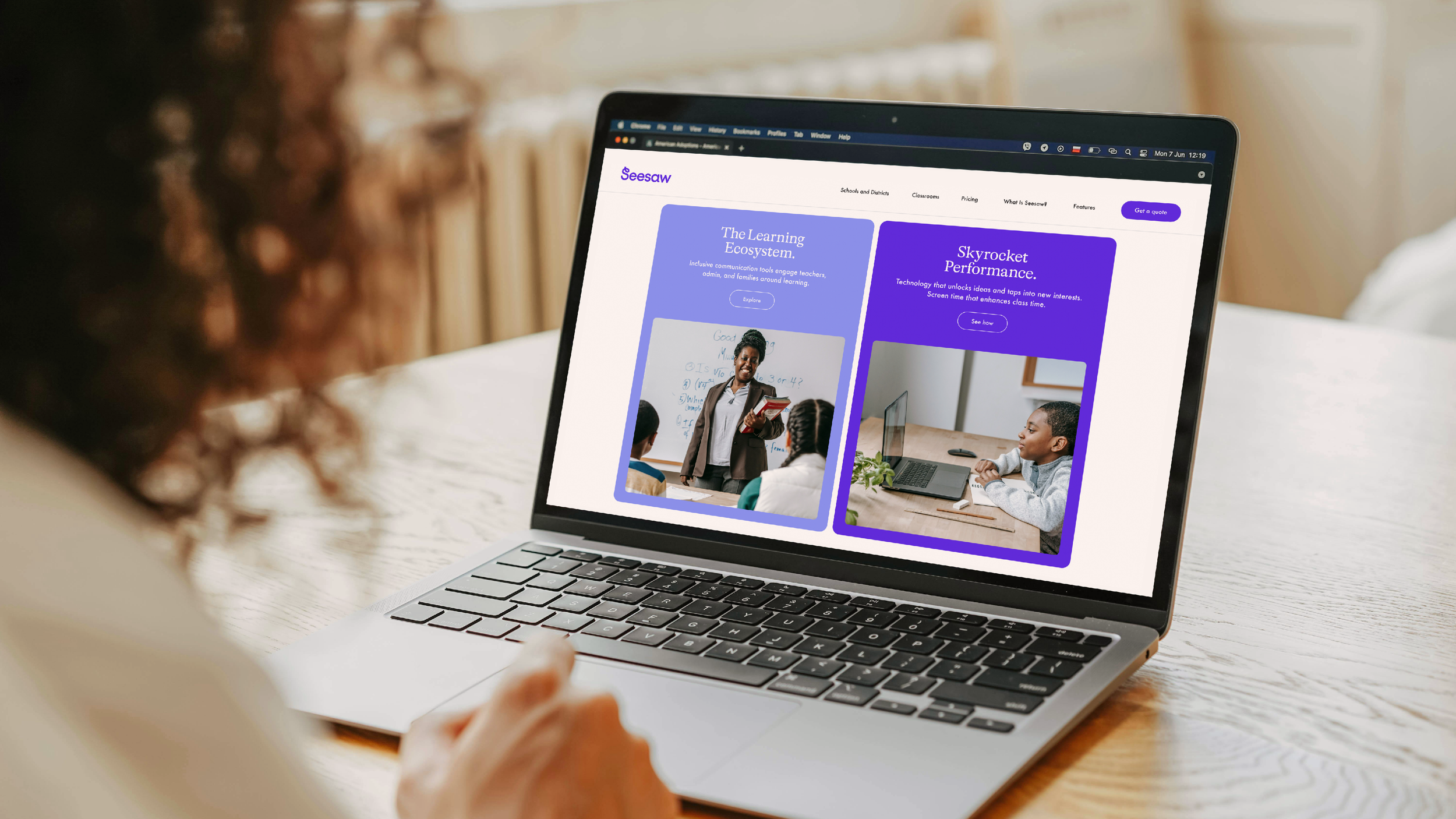
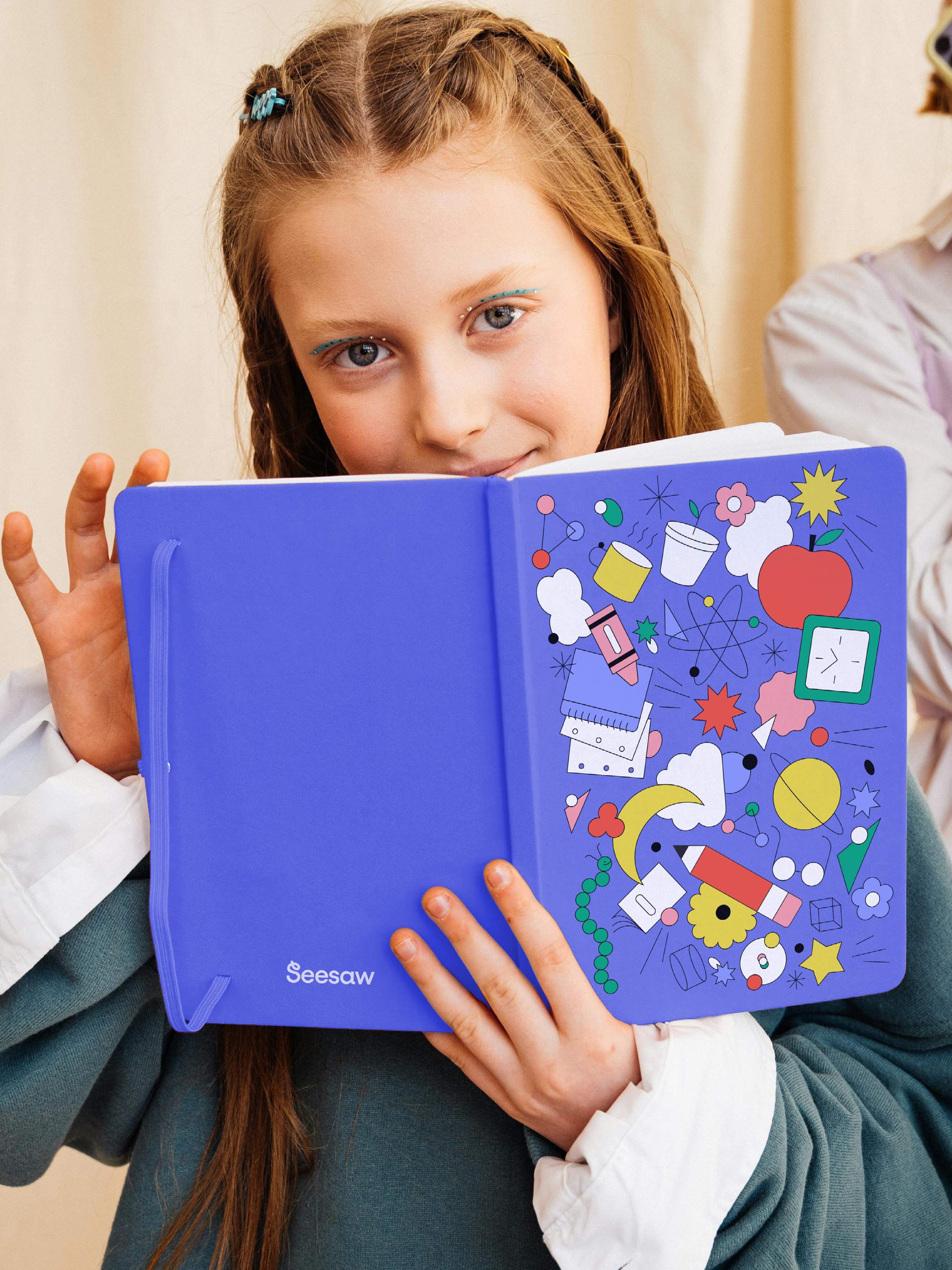
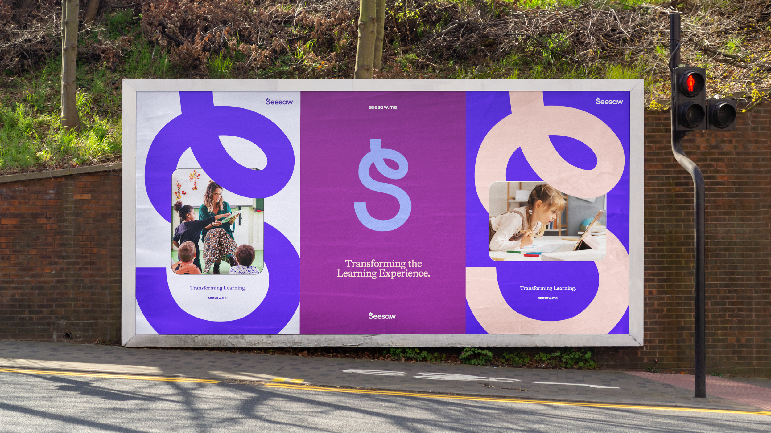
Photography and image treatments introduce the human side of the platform, highlighting real classroom moments and family connections. These elements combine with energetic graphic gestures that weave through layouts, connecting people, ideas, and learning journeys.
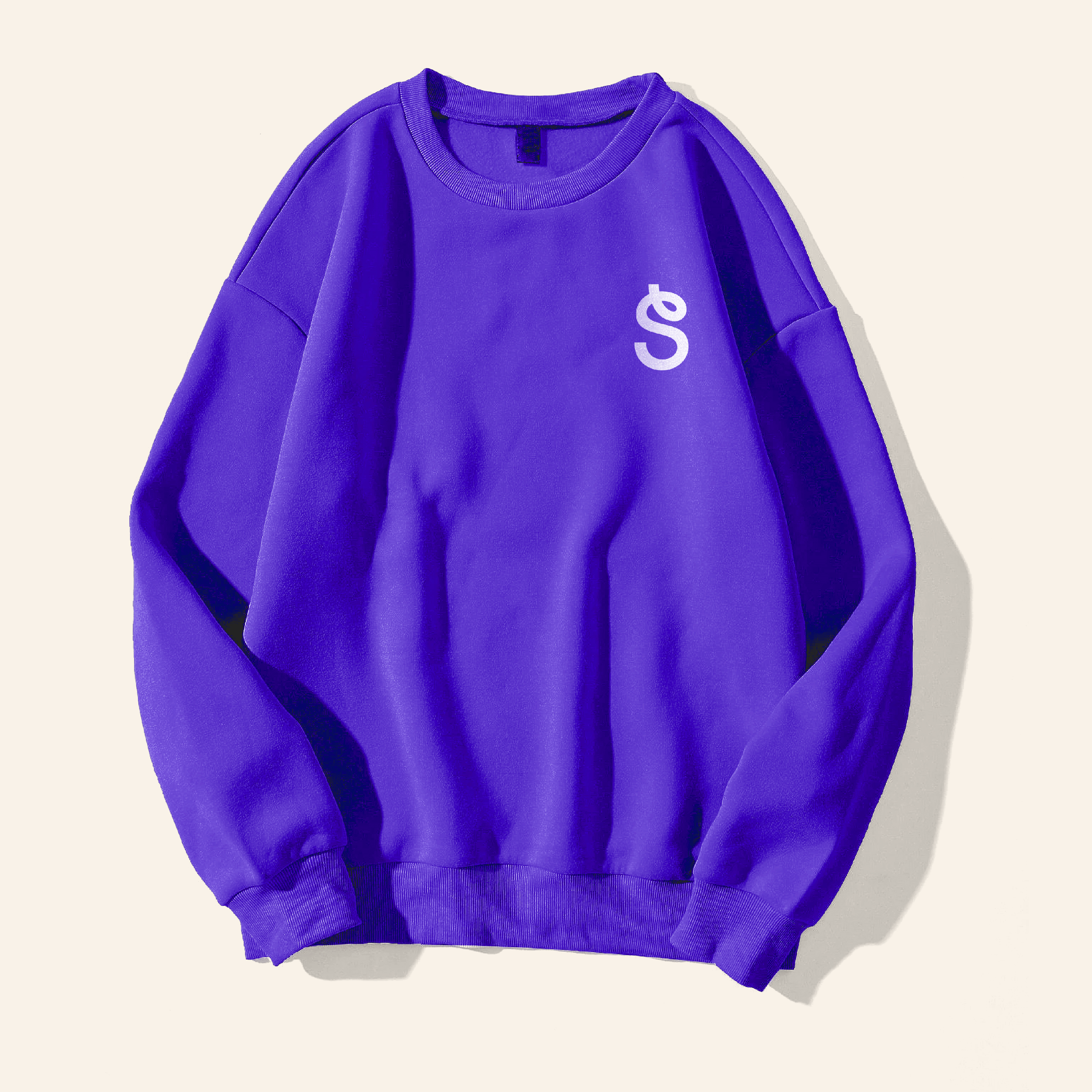
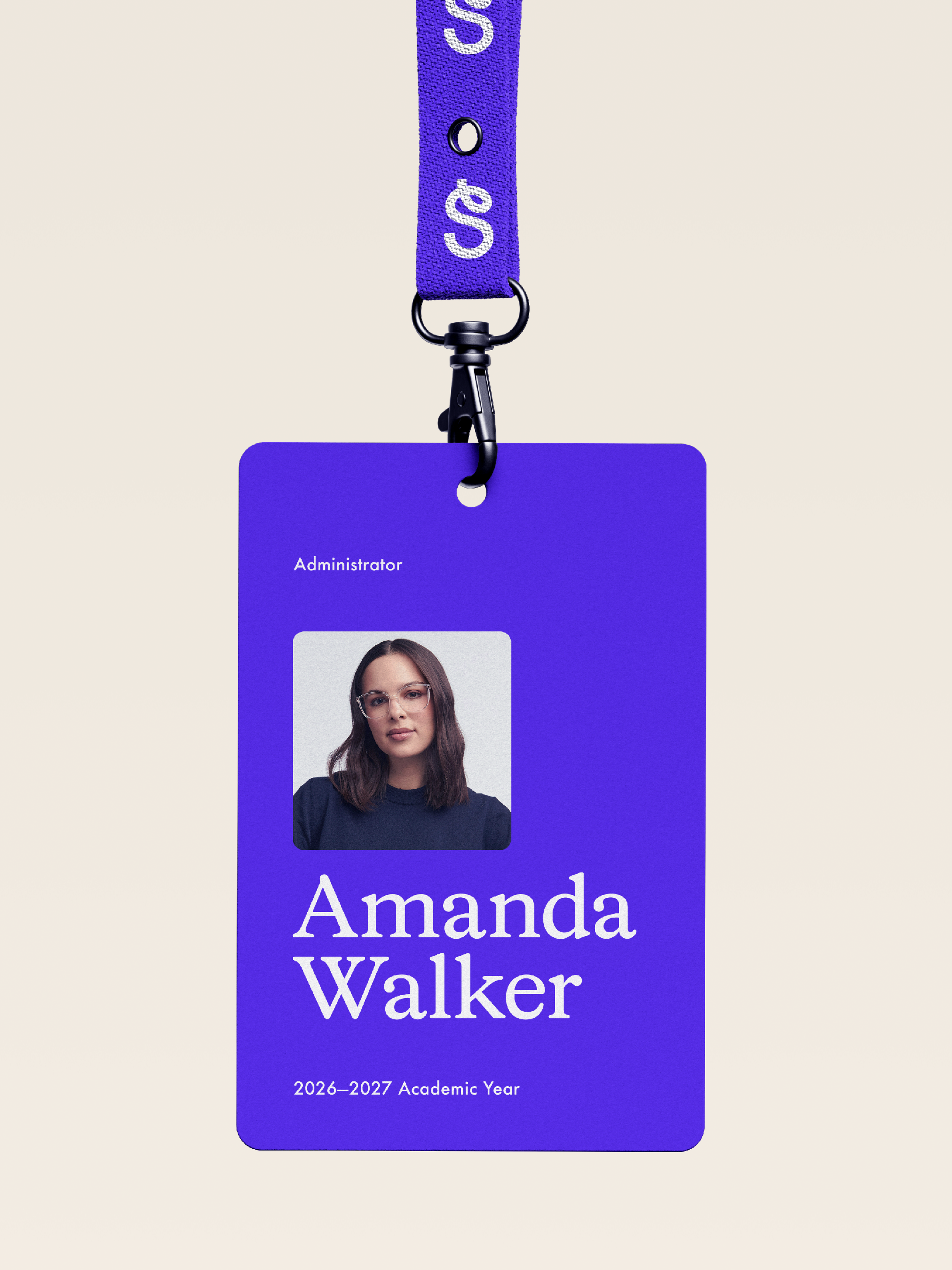
The system was designed to work fluidly across environments—from large-scale marketing installations and campaigns to digital product interfaces, educational content, and classroom communications. Packaging, promotional materials, and school-facing collateral demonstrate how the identity extends beyond the screen into tangible experiences.
Together, these elements form a flexible brand toolkit that empowers Seesaw’s internal teams to communicate consistently while maintaining the sense of curiosity, playfulness, and optimism that defines the learning experience.
Visual Identity System
Team
Client: Seesaw
Agency: IfThen
Executive Creative Director: Jack Whitman
Art Director: Ricky Tse
Senior Designer: Julie Sharpe
Strategist: Kenny Ferguson